How a bunch of scientists and a man named Newt helped inspire a lifelong interest in the world of typography
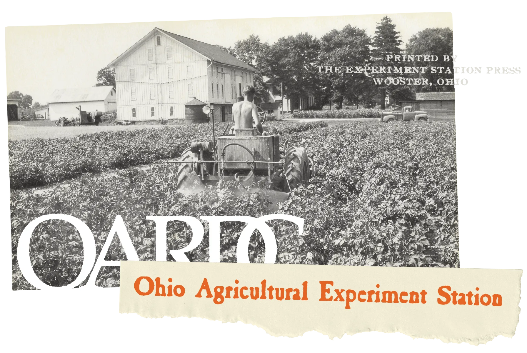
Imagine you’re a kid getting ready for school inside the old farmhouse you live in, while outside the farm buildings and fields are already humming with activity. But we’re not talking about the usual farm stuff you might be thinking of. Instead, it’s men in white lab coats standing in the fields with clipboards, a crew of field hands taking orders from researchers, green trucks parked everywhere, along with odd machinery getting ready to work in the field plots staked out with colorful plastic flags. As the school bus pulls up, everyone stops and waves. Then the men go back to their clipboards and machinery. This was the world I grew up in, living on the Snyder Farm, one of many research farms managed by the Ohio Agricultural Research and Development Center (OARDC), part of The Ohio State University. My dad was the farm manager of the Snyder Farm, and living in the farmhouse was one of the benefits of the job. My grandfather had also worked for the OARDC, and, though I didn’t know it at the time, I would go on to work for it, too.
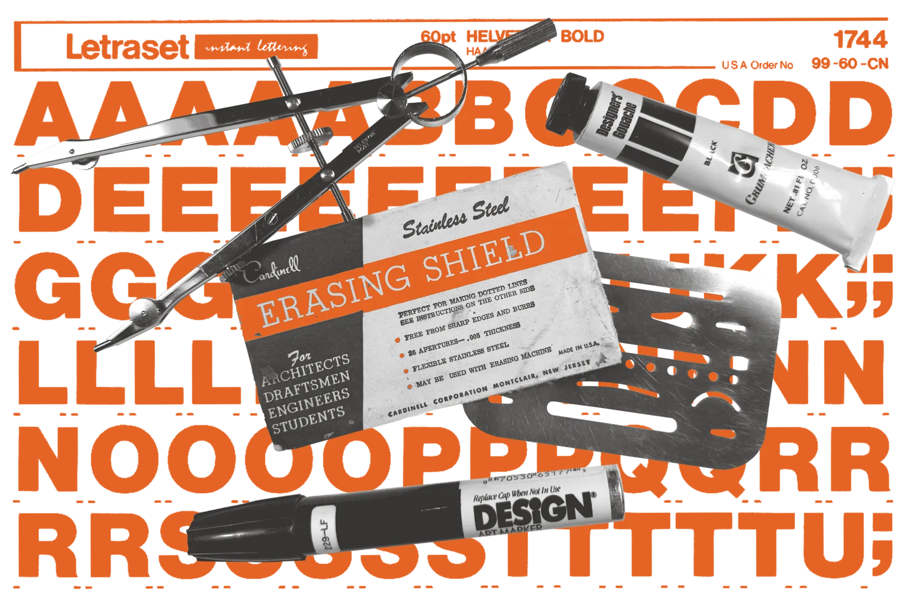
The reason this is on my mind is that recently I’ve been wondering where my interest in typography started. I’ve always loved to draw, and I spent many hours on the living room floor of that farmhouse sketching whatever came to mind. I could get carried away. I still have a piece of graphite embedded in the palm of my hand due to an accident involving a pencil and plush 1970s carpet as proof. But design, and especially type? I think I can pinpoint it to the day my dad took me along with him on a visit to the administrative campus a few miles away and introduced me to Newt Hartrum, the graphic designer for OARDC. Newt graciously showed me around his office building, including the print shop, and I marveled at all the projects he was working on, from illustrations to layouts for publications. I remember being quite taken with his drafting table and art supplies, everything from gouache to Rapidograph pens to Letraset. It was the first time in my life when I realized that a person could get paid to do the things that I already enjoyed.
Something clicked for me that day, and I began to look at things around me differently, to really notice and observe things. And there was no lack of inspiration. The OARDC at that time was like something out of a David Lynch movie. On the surface, daily life seemed fairly normal, even fun, but there was always a creepy undercurrent that couldn’t be ignored. The research element was mysterious. There were rooms in the barn my brother and I were forbidden to enter. People whispered about radioactive cows (it’s true, and I know where they’re buried). Cows with windows in their sides (also true). Rumors of tunnels beneath all the buildings. Helicopters landing in distant fields. Buildings where scary stuff like anthrax was studied. And always men in lab coats, looking very serious as they made notes while holding their clipboards. But I also became aware of the fact that I was surrounded by an incredibly rich graphic landscape.
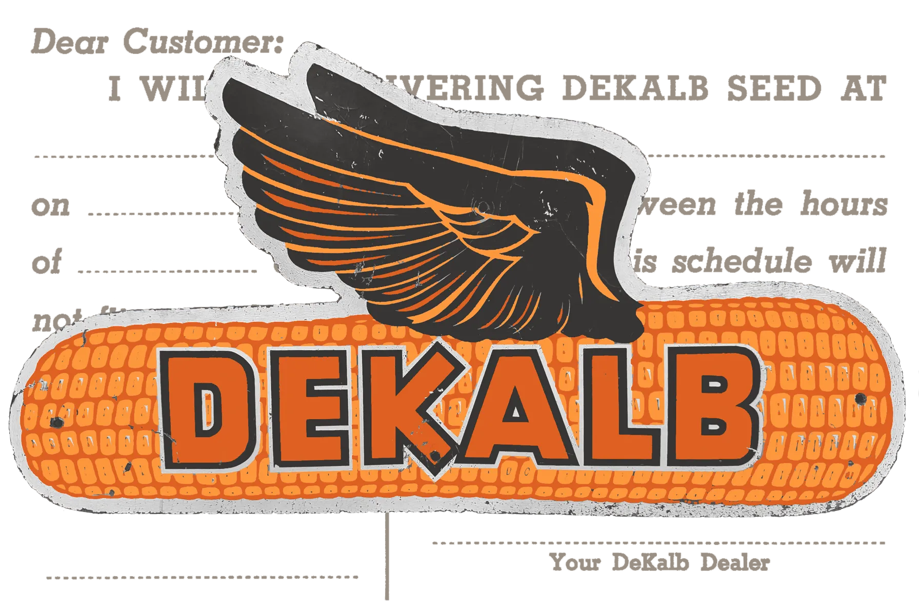
First of all, there was the signage. At a research facility, everything is well-labeled. From the dimensional lettering on the buildings to the placards identifying plants in the arboretum, to fallout shelter signs and posters announcing field trials of different crops, there was type everywhere. OARDC was also very good about putting its initials on things, whether that was a metal badge on a chair or a stencil on a crate. Tractors and equipment had great, colorful logos. There was always a variety of printed material lying around: journals and annual reports, magazines, books, brochures advertising events, and packaging of all sorts. Much of it was designed and printed right there on campus.
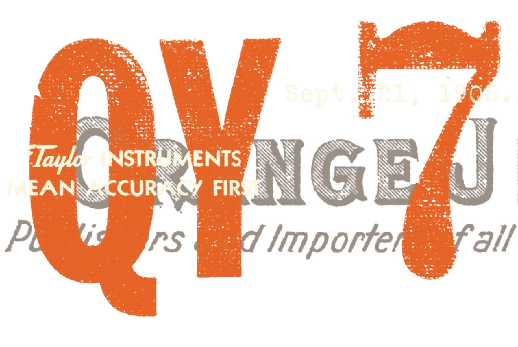
Fast forward to high school and college, where my interest in art and design flourished. I was on the staff of both the yearbook and school newspaper, and was lucky to have a sympathetic industrial arts teacher who took me on a field trip to the graphic design school at Kent State University, where he introduced me to screen printing, print production, and, new at the time, digital desktop publishing. I ended up going to a more traditional art college, but my favorite class was Introduction to Typography. After school, I spent three years rotating through various field and laboratory positions at OARDC until the graphic design itch came back to me. I applied for an entry-level position with a local publishing company. I think they would have hired any warm body, but the art director took me under his wing and became my first real mentor. In addition to teaching me the software (Quark XPress and Photoshop, primarily), he opened my eyes to the world of type. He had a hard drive loaded with thousands of fonts, many professional, and our tiny design department went wild using them all. Nobody ever thought to ask where he had acquired them.
After three more years, I was getting tired of cranking out ads and tourist publications. I had subscribed to Print and HOW magazines, and had gotten my hands on a bunch of old Communication Arts issues as well. I knew what I was doing wasn’t “good” design. Around that time I got word that the OARDC was looking for another staff designer. Newt had been retired for a few years, and the position had been on hold but had been reopened. I applied and, somehow, got the job, which was part of an entire communications team, with my time split between the local campus and the Columbus campus. Suddenly I had an office of my own, the latest Mac computers (a desktop and a laptop), a print shop in the building, a decent paycheck, and a library of professional typefaces with legitimate licenses! The icing on the cake was the guys from the print shop getting Newt’s drafting table out of storage for me, along with boxes of his art supplies, reference books, and magazines. It was 1999, and I was finally on the road to being a professional designer.

I worked for OSU/OARDC for ten years. After that, my career took several turns, including a stint doing freelance illustration (abruptly cut short by the 2008 financial crisis), an in-house corporate designer (until the company was bought out and my position was made redundant), and an art director at a boutique design firm. Eventually I left to start my own design practice, which I run to this day. During that time, I kept creating type on the side until I released my first commercial font in 2014. That’s when my foundry, Midwest Type, officially began.
It’s been a long, slow journey for the foundry to get to where it is today, but with the knowledge I’ve gained over time and after being acquired by The Type Founders in 2023, I’m hopeful that its best days are yet to come. I feel like the foundry’s vision has come into focus, and my next few releases will reflect that, along with a levelled-up skill set and more broadly useful fonts. My interest in typography has only grown over the years. Thanks for reading, and I hope you’ll come back here and continue the journey with me. Maybe someday I’ll tell you where the radioactive cows are buried.